Skip to content


The right color can turn a bedroom into a genuinely restful space, or quietly work against sleep without you realizing why. For adults, a calming bedroom usually means something soft and grounded rather than stark white or overly bright — a palette that feels mature, comfortable, and easy to live with every day.
These 10 calming bedroom colors for adults cover a range of moods, from soft and airy to warm and grounded, so you can choose the direction that fits your room’s light, furniture, and your own sense of calm.
1. Soft Sage Green for a Natural, Calm Feel
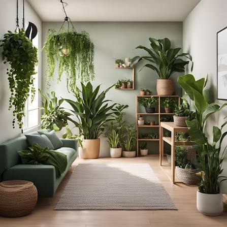
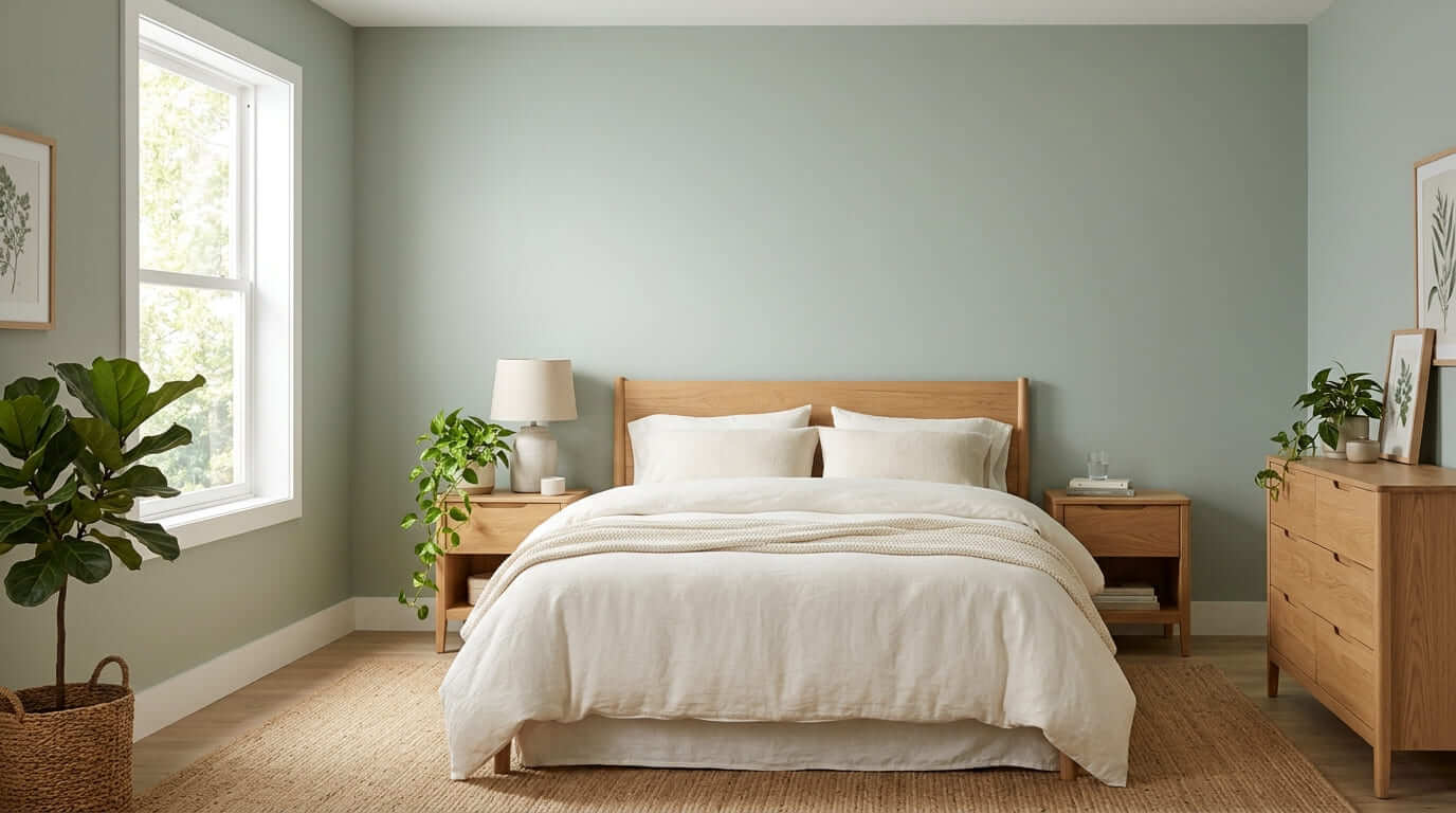
Sage green is one of the most reliable calming bedroom colors because it echoes nature without feeling bold or trendy. Its muted, slightly gray undertone keeps it from feeling too saturated, which makes it easy to live with long term. Pair it with warm white bedding, natural wood furniture, and a few plants to reinforce the natural, grounded feeling. Sage also works well in rooms with plenty of natural light, where it can read as soft and fresh rather than dark.
2. Warm Greige for a Balanced Neutral
Greige — a blend of gray and beige — is a popular choice for adults who want a calming color without committing to an obvious “theme.” It reads as sophisticated and quiet rather than cold. The exact tone shifts depending on the room’s lighting, sometimes leaning warmer, sometimes cooler, which makes it a flexible backdrop for changing your bedding or accessories over time. Pair it with cream, soft brown, and natural textures for a cohesive, calm result.
3. Dusty Blue for a Peaceful, Airy Bedroom
Blue is one of the most studied colors for promoting a relaxed state, and a soft, dusty blue in particular avoids feeling cold or sterile the way a bright or icy blue can. Choose a muted, grayish blue rather than a saturated one for the calmest effect. Pair it with warm white trim, light wood furniture, and natural linen textures so the room still feels warm rather than clinical.

4. Soft Taupe for Warmth Without Drama
Taupe sits between beige and gray, offering warmth without the brightness of a true beige. It’s a particularly good choice for adults who want a bedroom that feels settled and mature rather than playful. Because taupe is a true neutral, it pairs easily with almost any accent color — introduce depth through a navy or forest green throw, or keep everything monochromatic for a quieter, more minimal result.
5. Warm White Instead of Stark White
A pure, stark white can feel clinical and cold in a bedroom, working against the relaxed mood you’re likely aiming for. A warm white — with a hint of cream or beige undertone — keeps the brightness while feeling considerably softer. This is a useful option if you want a light, airy bedroom but have found that bright white feels too sterile. Pair it with warm wood tones and soft textiles to avoid the room feeling flat.

6. Muted Lavender for Subtle Calm
A heavily diluted, grayish lavender can introduce a touch of color without tipping into anything bold or juvenile. Because the tone is so muted, it reads as sophisticated rather than themed, which is why it works for adult bedrooms specifically rather than feeling like a child’s room. Keep the rest of the palette simple — cream, warm white, and natural wood — so the lavender remains a quiet background note rather than the main event.
7. Soft Terracotta for Warmth and Grounding
For adults who find pure neutrals a little cold, a soft, muted terracotta offers warmth and personality while still feeling calming rather than energizing. The key is choosing a dusty, faded version of the color rather than a bright, saturated one. This works particularly well as an accent wall behind the bed, paired with cream bedding and natural wood, rather than covering every wall in the room.
8. Pale Blush for a Soft, Relaxing Tone
A very pale, dusty blush — closer to a warm neutral than a true pink — can feel surprisingly calming and sophisticated in an adult bedroom. The key is choosing a muted, grayed-down version rather than anything bright or saturated. Pair it with warm white, soft gray, and brass or warm wood accents to keep the overall feeling grounded and grown-up rather than overly sweet.

9. Deep Charcoal as a Calming Accent
Darker colors can feel calming too, particularly for adults who want a cocooning, restful atmosphere rather than a bright one. Deep charcoal works especially well as a single accent wall rather than covering the entire room, which keeps the space from feeling heavy. Balance it with warm lighting, cream bedding, and natural wood furniture so the room still feels inviting rather than closed in.
10. How to Pair Calming Bedroom Colors for Adults With Bedding and Decor
Once you’ve chosen a wall color, the rest of the room should support it rather than compete with it. Keep bedding in a complementary neutral or a slightly deeper or lighter version of the same color family, and introduce texture — linen, wool, natural wood — rather than additional strong colors. For more on layering bedding and finishing details around your color choice, see our 10 Bedroom Decor Ideas guide.

How to Choose the Right Calming Color for Your Bedroom
Start by looking at the room’s natural light. A north-facing bedroom with cooler light often suits warmer colors like greige, taupe, or terracotta, while a bright, south-facing room can handle cooler tones like dusty blue or sage without feeling cold. Consider your existing furniture next — a warm wood bed frame pairs naturally with earthy tones, while black or metal furniture can work well with cooler neutrals. Finally, test a sample on the actual wall and look at it morning, afternoon, and evening before committing. A color that looks calming in a paint app can shift considerably once it’s on a full wall in your room’s specific lighting.
Calming Bedroom Color Mistakes to Avoid
Choosing a color only from a small swatch A tiny sample can’t show you how a color will behave across an entire wall. Always test a larger sample first.
Going too bright or saturated Even colors generally considered “calming,” like blue or green, can feel energizing rather than restful if the saturation is too high. Choose muted, grayed-down versions for the calmest effect.
Ignoring the room’s natural light The same paint color can look completely different in a bright room versus a dim one. Always test in your actual space at different times of day.
Painting every wall a dark, dramatic color Darker colors can be calming in moderation, but covering every wall can make a bedroom feel heavy rather than cocooning. Consider one accent wall instead.
Forgetting about lighting temperature A calming wall color paired with harsh, cool-toned bulbs can undo the entire effect. Use warm bulbs (2700K–3000K) to support a restful palette. For more on bedroom lighting, our Bedroom Wall Decor Ideas guide covers wall sconces and warm lighting options.